Mymorial

Mymorial - Keeping Memories Alive & Support for Navigating Grief & Loss

Mymorial is an online platform to assists people in overcoming their bereavement after losing someone. The main focus of this project is for grieving families or individuals. It looks at different ways of solving the emotional challenge of having to live through such a tragedy by keeping memories alive as online memorial journal with community supports. Design thinking process is applied to solve this issue and to bring empathy to the next level.

My Role

UX Research, Branding, Illustration, UX/UI Design

Team

Sole UX/UI Designer

Project Timeline

April - Jun 2022 (6 weeks)

Tools

Figma, Illustrator, Photoshop, Notion, Google Form

Context

Navigating grief and loss is hard.

‍
Death may be a natural occurrence as a part of every living things but losing a loved one is never easy. In fact, death of a partner, close family member, or friend consistently ranks as one of the most stressful life events

"No matter how expected a loved one’s death may be, the pain of loss can be overwhelming and confusing. Bereavement affects everyone differently and has no set timeline"

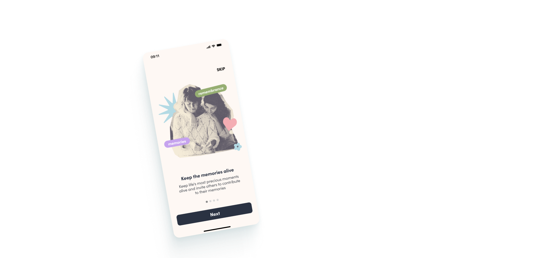
Therefore, I set out to design an iOS app solution to help these grieving individuals and families. Without further ado, here is my very first UX case study.

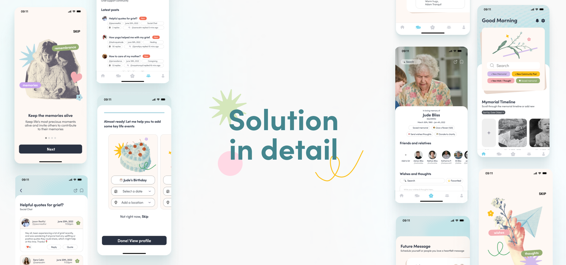
The solution

View Final Prototype

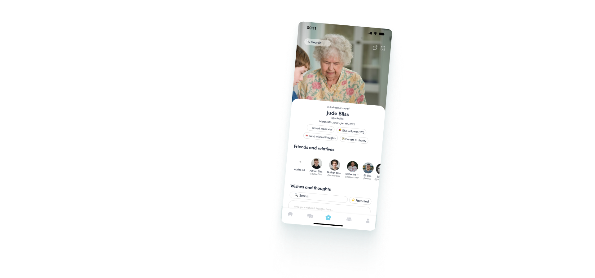
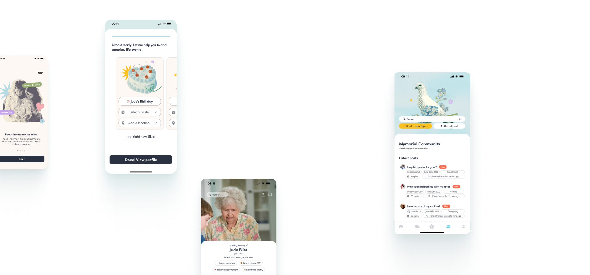
Mymorial Profile
‍
1 Collaborative initiative for family and friends to keep loved ones’ memories close to honour their life
2 Let current and future generations get to know your loved one and what they achieved
3 Users can also donate to the family or to a selected charity in honour of them
4 A way to share with anyone who can’t visit them at their funeral especially in the time of pandemic
5 Users can contribute in sharing their memories through Mymorial Timeline and their wishes and thoughts on the Mymorial Profile
6 Users also have the freedom to opt out for Mymorial profile but use any other features like community forum and future messages

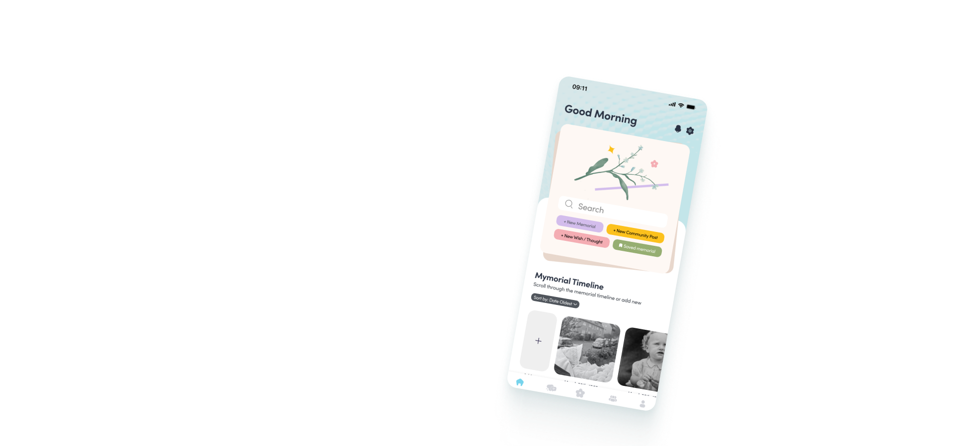
Mymorial Timeline
‍
1 A way to document life stories into a set of living timeline
2 Users are able to invite family members or anyone to collaborate and share their memories with the person
3 Users have the choice to keep the feature for only family & relatives, public or private
4 A way to share with anyone who can’t visit them at their funeral especially in the time of pandemic
5 A way for future generations to remember and honour their passed relatives’ life legacy

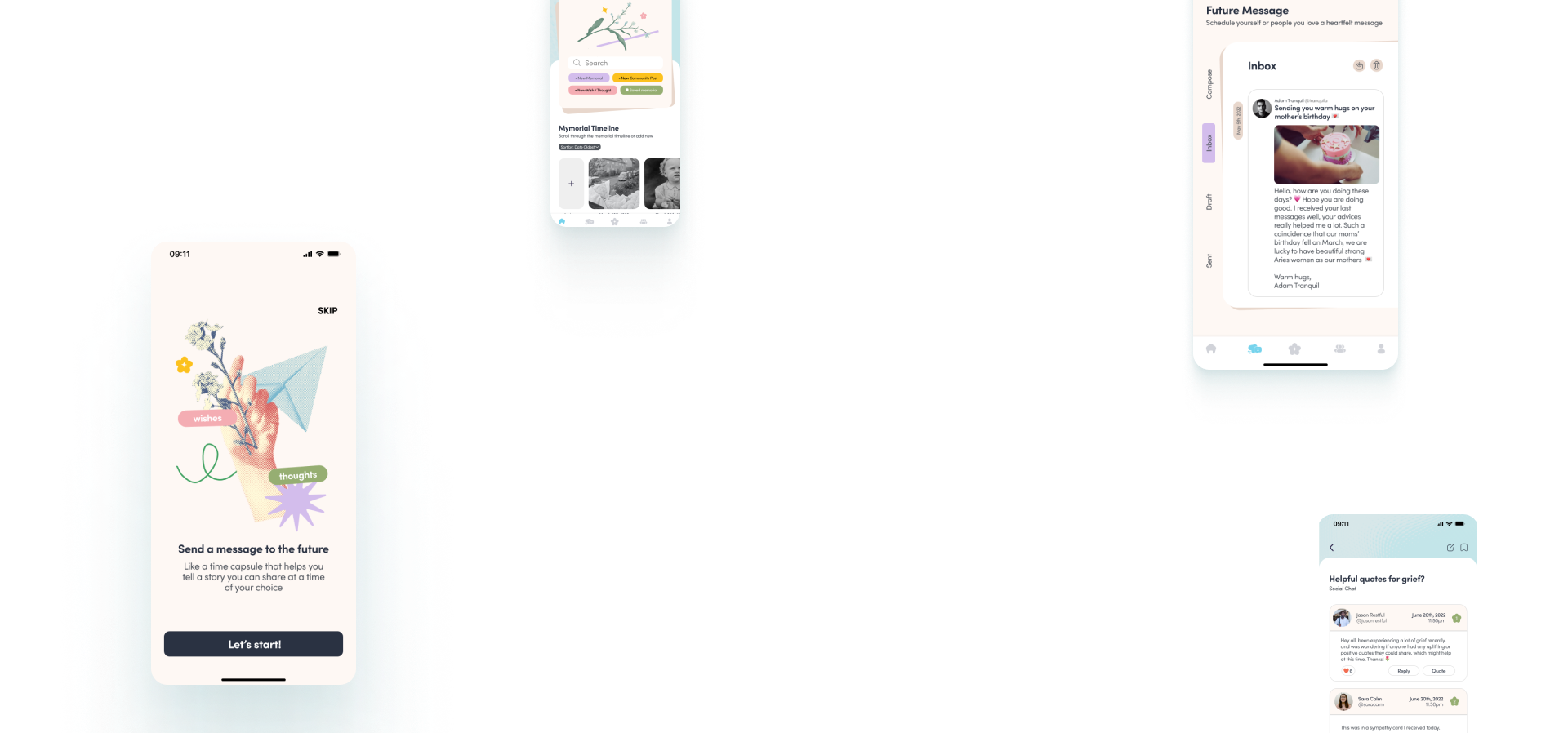
Future Message
‍
1 A digital time capsule for users to record a video or write a message and send it to someone on an occasion in the future
2 A way to schedule a message to a certain date in the future so users won’t miss it
3 Users can also send a message of encouragement or motivation or reminder or anything to themselves and set it to a date
4 Doubles also as normal messaging feature for users to connect with

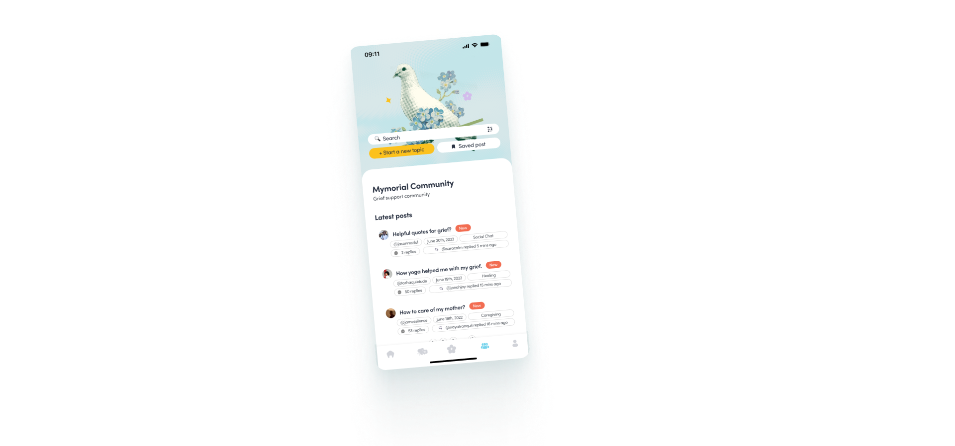
Mymorial Community
‍
1 Community forums can give you a place to share your grief and stay connected with others who are coping with the same emotions
2 Users conversations and experiences, while unique, may also help other people going through their own grieving process
3 Users can offer insight into other users grief through their own experiences and hopefully lead to ways that can help them feel better
4 Users can opt out to be anonymous to open or answer any topics in the forum

The Process

First of all, I had to understand certain things: who are the users and what their needs are, how the product would position itself on the market with other companies and solutions. To find this out, I decided to follow IDEO’s Human-Centered Design to make sure that my design decisions were supported by user research and feedback.

Empathise

  • Facebook
  • Survey
  • Data Analysis
  • User Interview
  • Competitive Analysis
  • Brainstorming

Define

  • Brainstorming
  • Persona
  • Jobs To Be Done
  • User Journey

Ideate

  • Card Sorting
  • Information Architecture
  • Crazy8/Sketches
  • Wireframing

Prototype

  • Branding
  • High Fidelity Prototype

Test

  • Usability Testing
  • Affinity Test
  • Final Prototype
  • Afterwords

Empathise01

Understanding the market and users

When I started this case study I realised that my prompt was pretty broad, so first we set out to answer a handful of important questions:
1 Who will this product be for?
2 What is the problem that will I try to solve?
3 What are the dynamics of this problem?

Grief Support

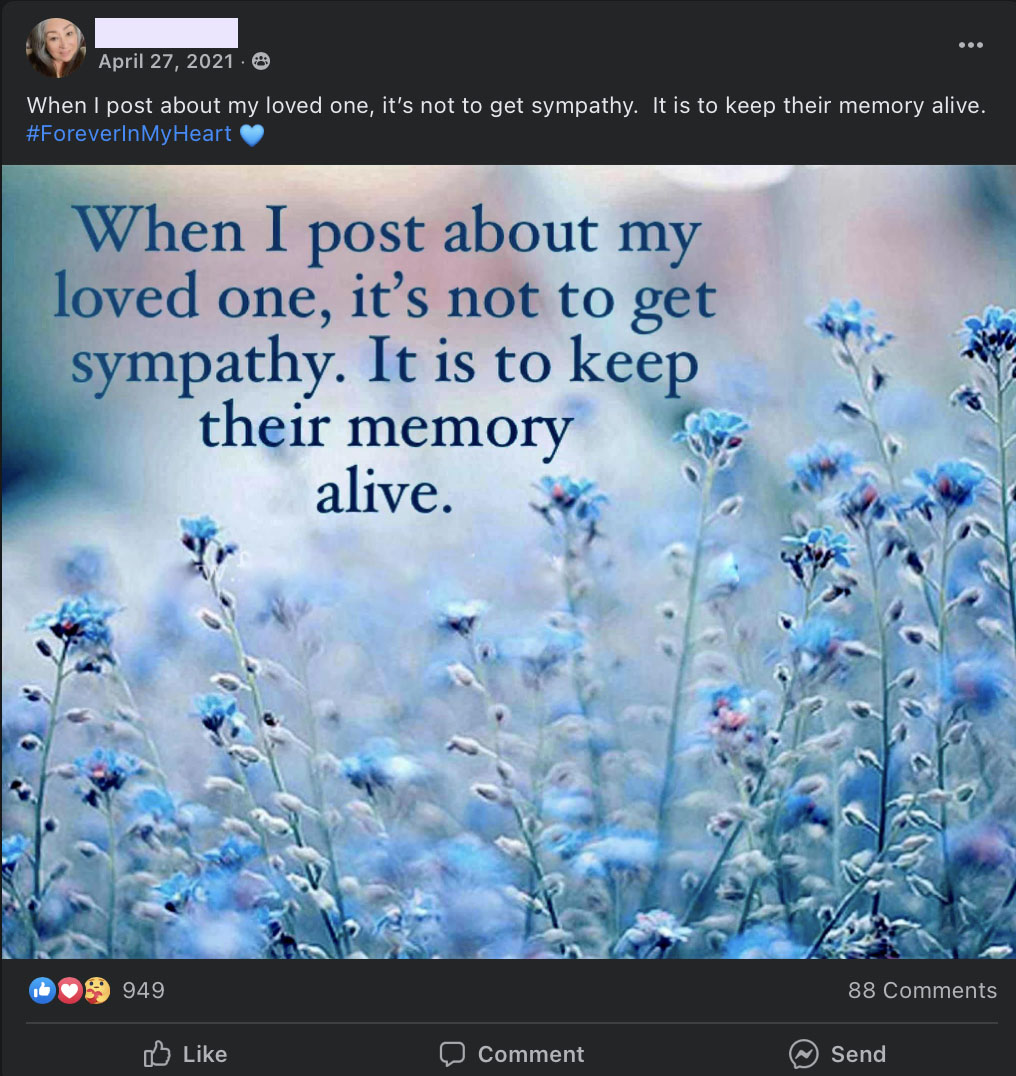
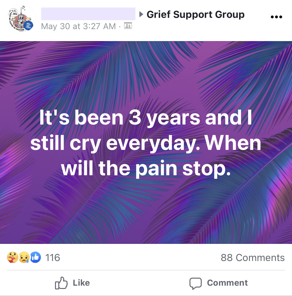
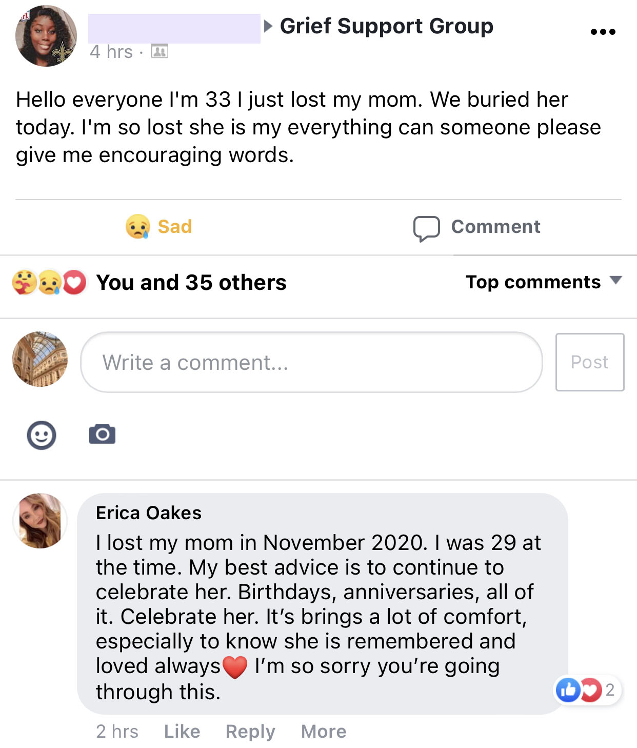
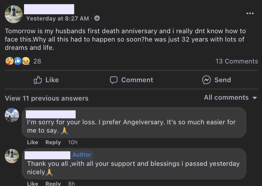
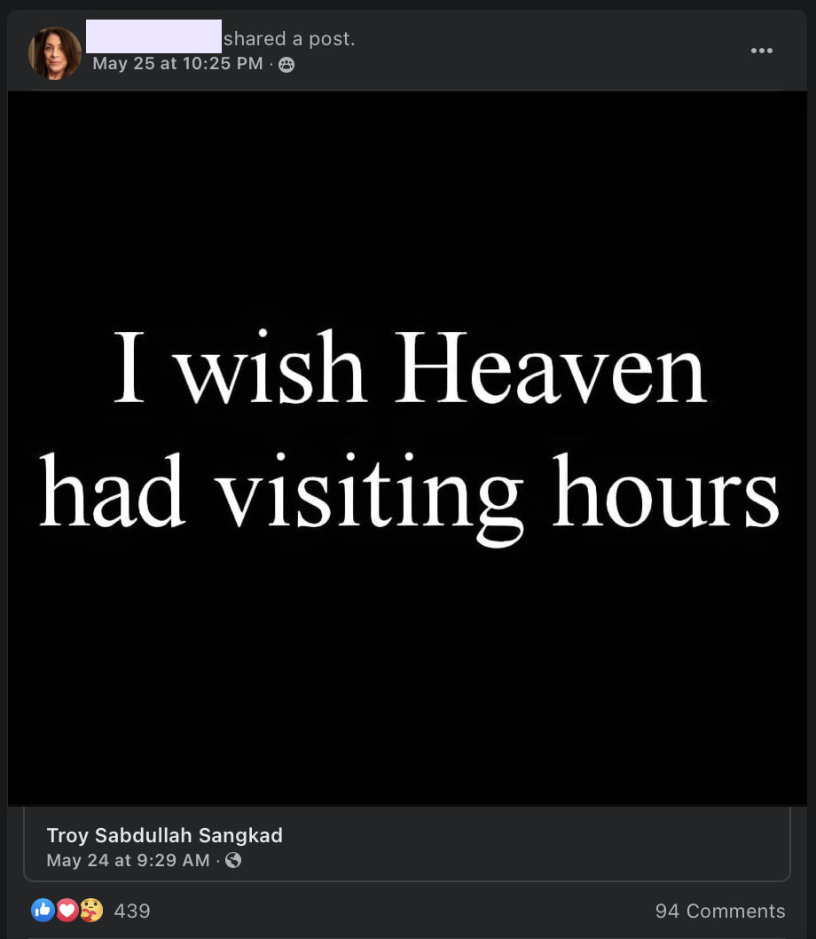
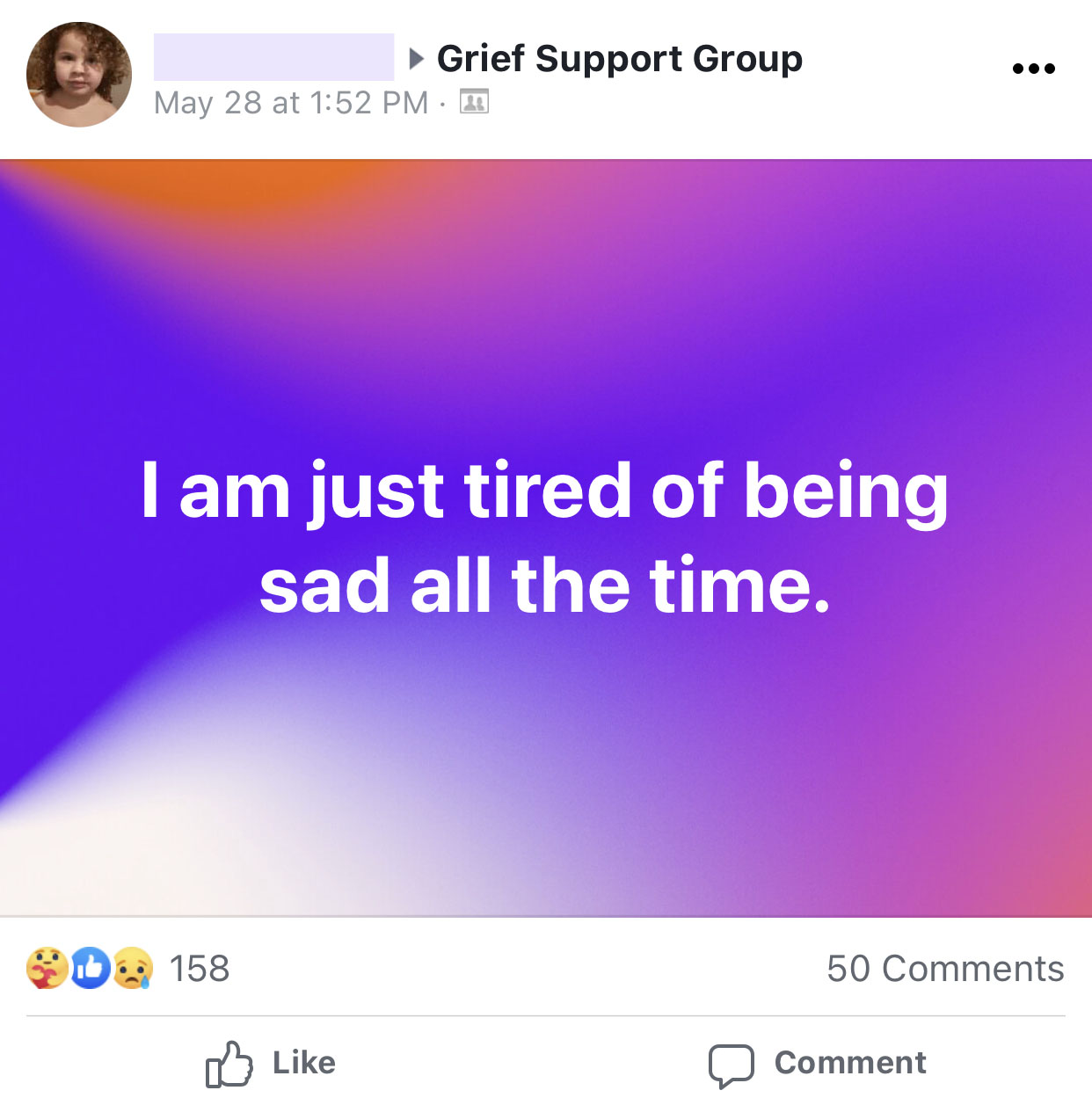
A Facebook group called Grief Support serves as a helpful resource for people to vent out, share their grief struggles and ask for advice. I was admitted to the group and would read their posts daily.

Posts from Grief Support group on Facebook

Reading these posts, it gave me better understanding of what they were going through. Each post would have lots of others trying their best helping each other out. This peer support is heartwarming to see, they are in many ways the “experts” when it comes to support as they experienced the same situation;

In bereavement support groups one can listen to what helps others and try out some of these things personally. Because other bereaved people have experienced many of the same reactions, they are in many ways the ‘experts’ when it comes to support. As is the case for other types of networks, other bereaved people must adapt their support to the person they are seeking to support and to the situation, whilst never forgetting that one’s own grief will never be like another person’s. — Effective Grief and Bereavement Support: The Role of Family, Friends, Colleagues, Schools & Support Professionals By Atle Dyregrov, Kari Dyregrov

Survey & Interviews

Though I gained some valuable insight from reading user posts and articles, I wanted to get some valuable information by placing a questionnaire and conducted contextual interviews.

Thanks to the Grief Support Facebook group page and Reddit, I found four users of varies ages and background that we willing to be interviewed. Before that, I read several articles on interview best practices, wrote a semi-structured script and scheduled my interviews.

To learn something new requires interviewing, not just chatting. - Steve Portigal, Interviewing Users‍
1 The survey received 42 responses within 3 days
2 I remote interviewed 4 individuals that are going through bereavement through Whatsapp Call & Skype
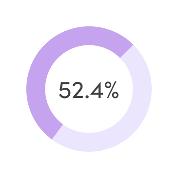
52.4% respondents sought every opportunity to get support after the loss
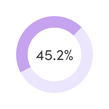
45.2% respondents did not get any help when they needed
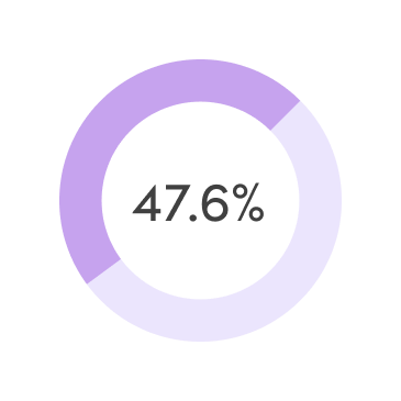
47.6% respondents think remembering the person will helps them grieve better
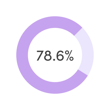
78.6% respondents think it is important to keep their memories alive

52.4% respondents think online community support could help them navigate through grief better
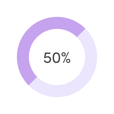
50% respondents think sharing their problems and venting it out would help with their grieving process

Interview participants:
1 Gender: 2 male & 2 female
2 Age: 21 to 48 years old
3 Duration: 20-30 mins on Whatsapp videocall & Zoom
4 All participants experienced losing someone they were close with

The following responses illustrate some parts of these interviews:

Click here to show

Remember that the loss of someone doesn’t mean they should be forgotten.
— Tips for navigating and coping with grief, University of Colorado

Research Synthesis

By highlighting and tagging for key moments from the interview session, I was able to uncover insights from qualitative data easily. Summarising the findings from my research, I prioritised the hypotheses for translating them into functional requirements.

From insights to needs:

1 Users are free to set up a memorial site for the passing person but it is up to them to decide if the profile would be in private for family and friends or public for everybody
2 Users should be able to sign up for online support forum feature to conveniently get support or help others
3 Users should be able to choose a convenient way of anonymous communication within the online support forum
4 The story-sharing feature should be accessible for users to engage them in communication within their family or friends and they are free to decide who can engage with it

Competitor Research

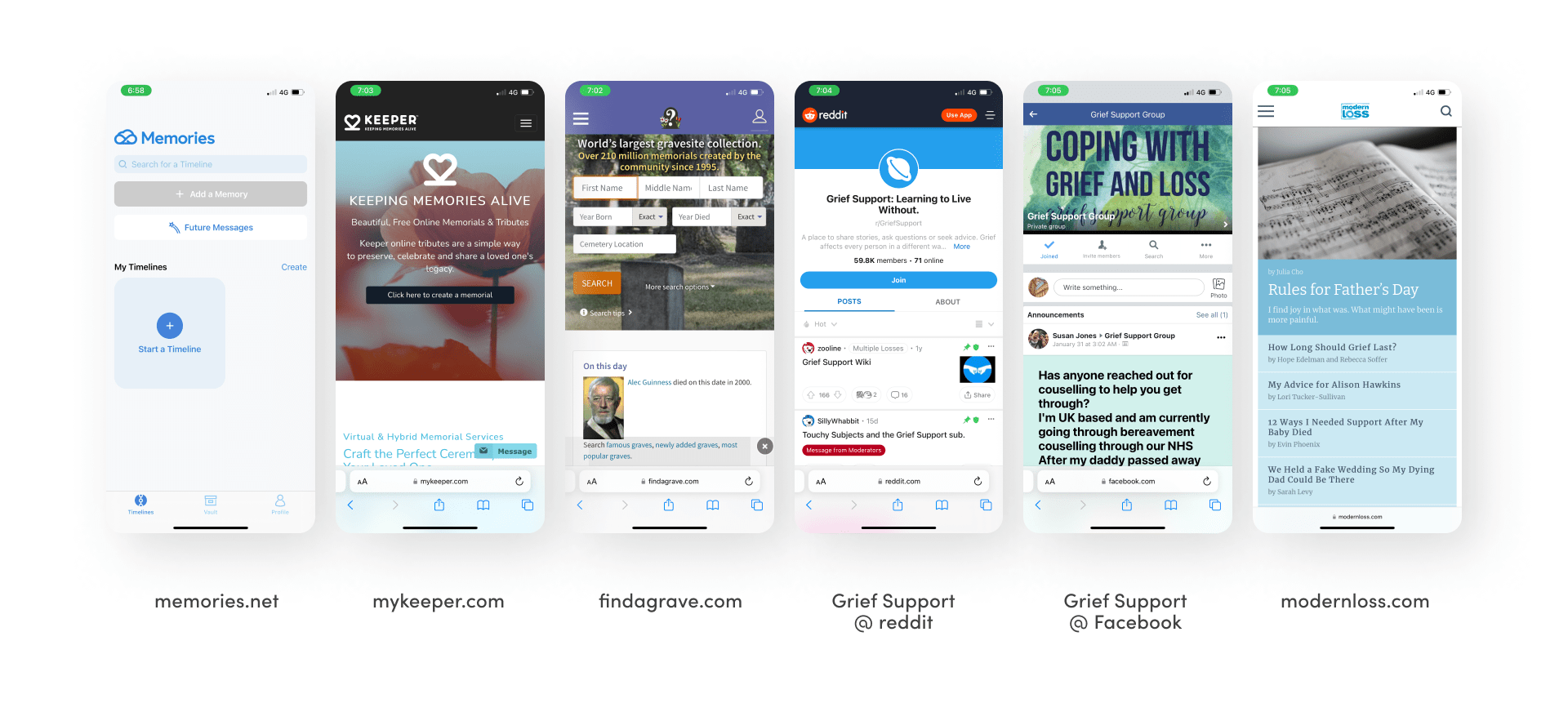
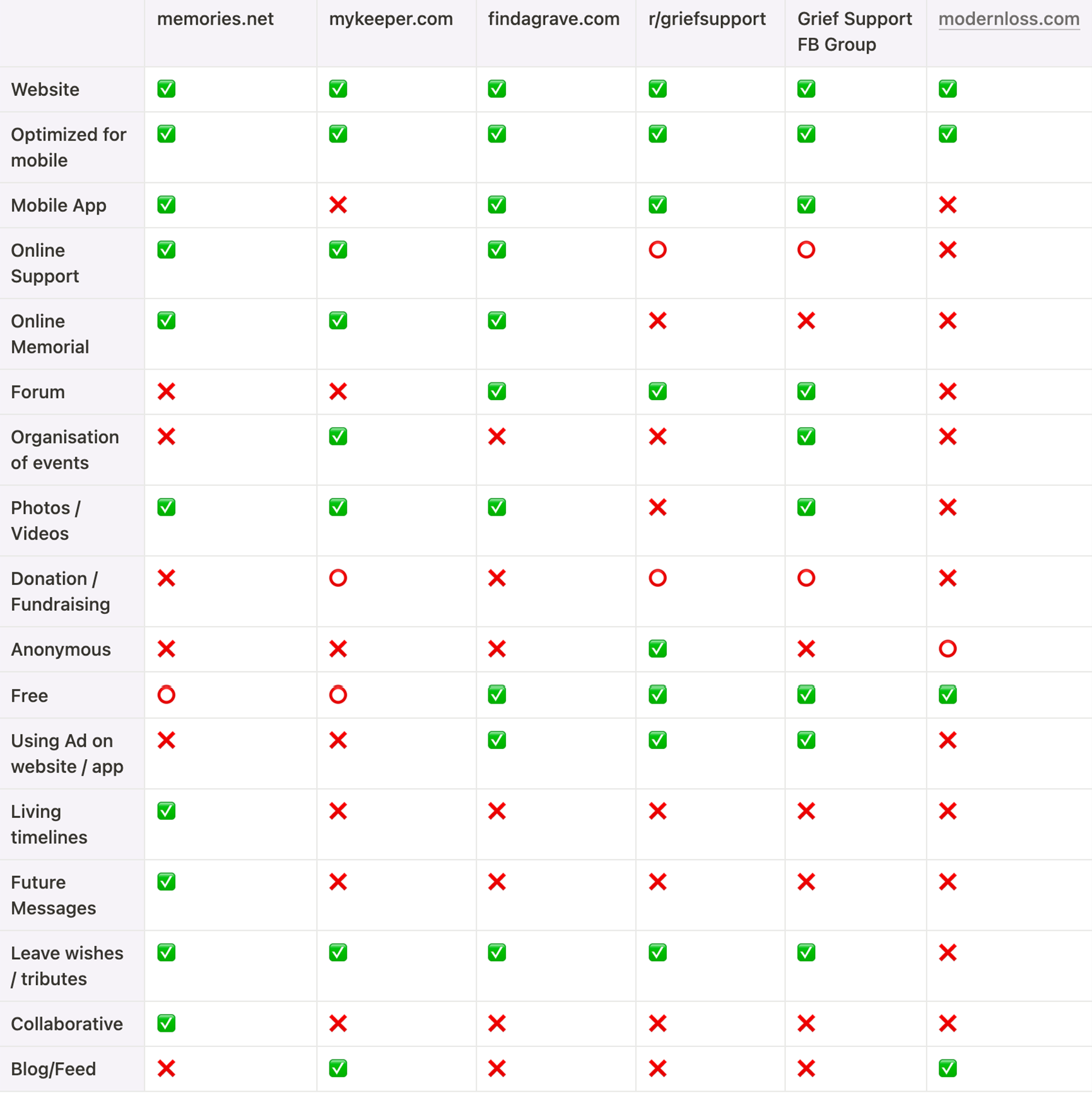
Based on the understanding and analysis from the user research, I moved to analyse competitors to gather insight into their strengths and weakness. I was suggested a few frequent apps/websites that grieving users go to based on the surveys and interviews which I included in this analysis.

At the moment, there is no direct competitors that fulfilled user needs based on the user research insights making them having to use multiple services (including paying multiple services) just to get their needs met. For this competitive analysis, I compared multiple products that targeted the same target users that provide services such as online memorial, forums & counselling. I didn't include 7cups as suggested by one of the interviewees because its an online counselling forum that deemed too broad for this specific topic.

Competitor Research between Memories.net, Mykeeper.com, Findagrave.com, Reddit r/griefsupport, Facebook group Grief Support, and Modernloss forum

Key insights:

1 only 1 out of 6 provide collaborative feature
2 only 1 out of 6 provide timeline living memories sharing feature
3 only 1 out o f 6 lets users post anonymously
4 2 out of 6 provide organisations of events
‍

Brainstorming

Based on the user interviews, online survey and competitive analysis, I started brainstorming on important features that I can implement in the application in which I rationalise further on along the process.

Profile

Community

Messages

Profile infos

Grief Issues

Normal messages

Family & Friends

Healing

Future messages

Wishes & Messages

Religion & Spirituality

Self future messages

Life timeline

Chat

Scheduled messages

Donation/Charity

Anonymous Posts

Time capsule

Define02

Concreting the problems

User Persona

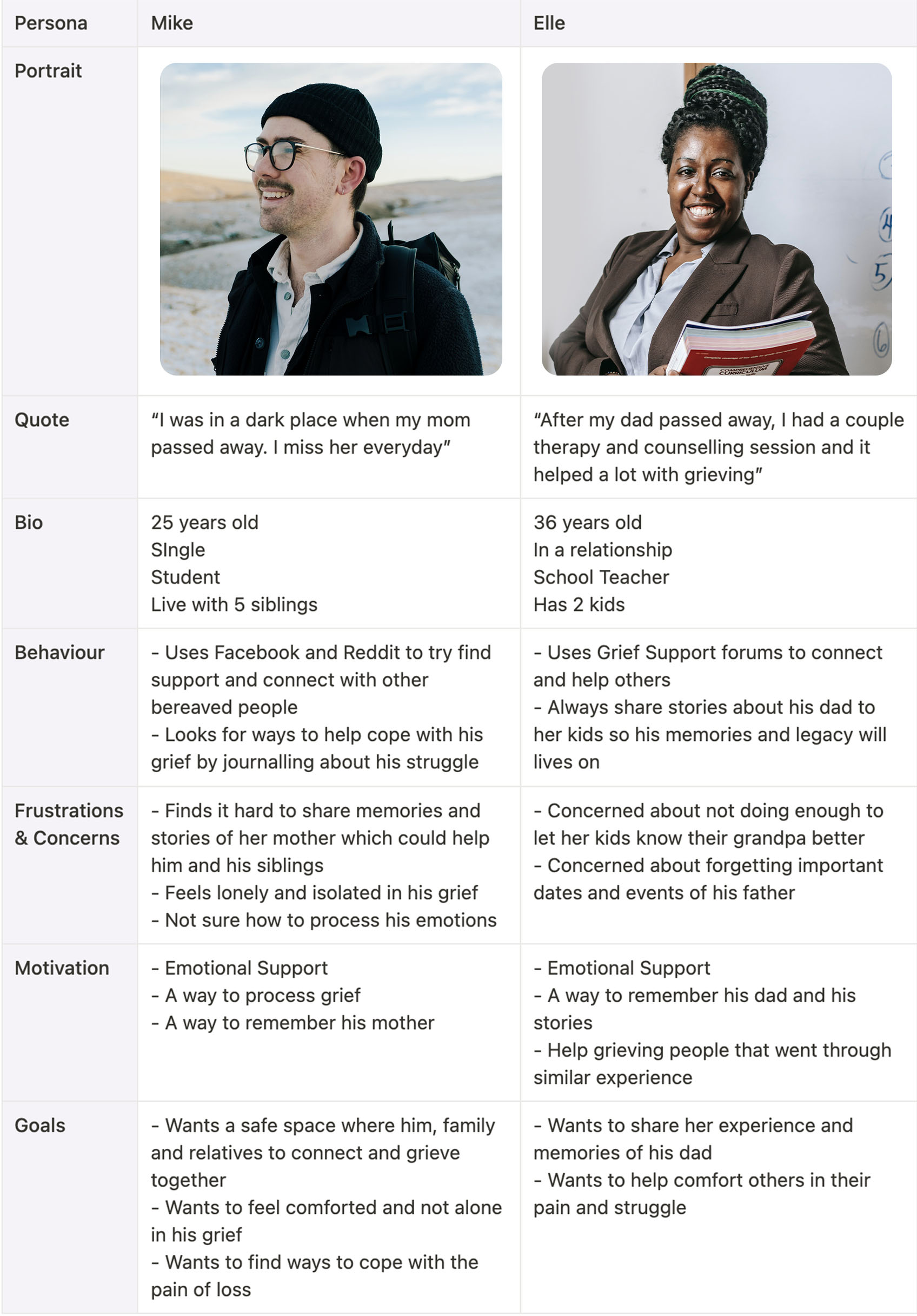
Using what I had learned from my users, I create two personas; Mike and Elle. Both personas were created based off the feedback I collected from my research.

Personas provide us with a precise way of thinking and communicating about how groups of users behave, how they think, what they want to accomplish, and why. - About Face by Alan Cooper
User persona for Mike & Elle

1 Mike represents those who are grieving the death of a loved one and are looking for ways to cope with the loss.
2 Elle represents those who recently experienced loss and wanting to help others in coping with the loss and wanting to keep the memories of the deceased person alive.

Jobs to Be Done

Defining the problem; with a much clearer understanding of who I was designing for, I moved on to trying to clarify different contexts in which users would use this product through Jobs To Be Done framework to understand users’ motivation and desired outcome based on research and personas created:

Situation /  Motivation / Expected Outcome

1 When I feel concerned about forgetting the memories of my dad, I want to be able to share them with my kids and family, so that I can keep his memories alive
2 When I feel lonely and isolated in my grief, I want to be able to vent my problem and share my struggles, so that I can feel comforted and not alone in my grief
3 When I feel concerned about not knowing how to help my siblings with grief, I want to find a way to process grief better with them, so that we can find that safe space for us to connect and grieve together
‍

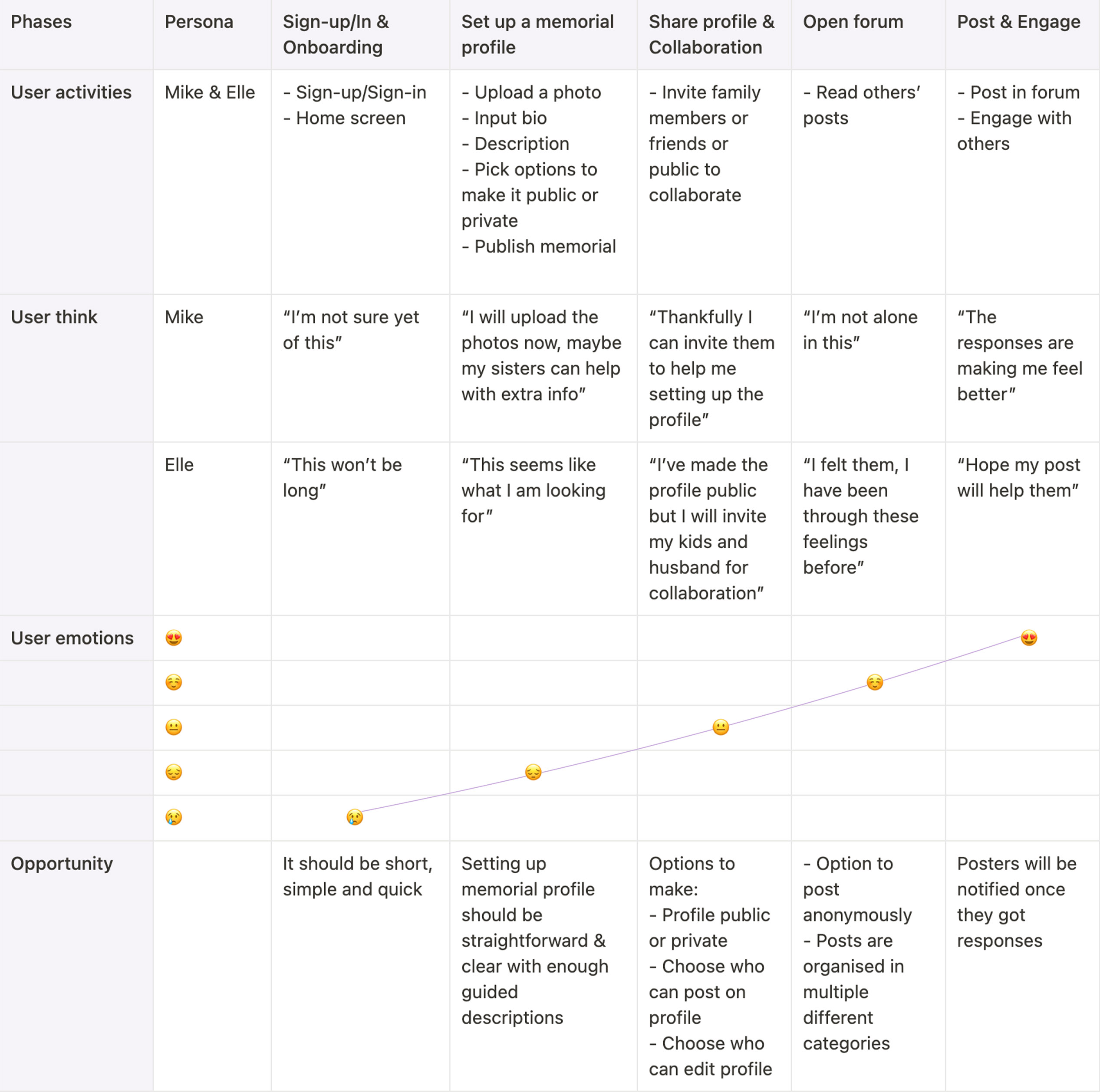
Users Journey Map
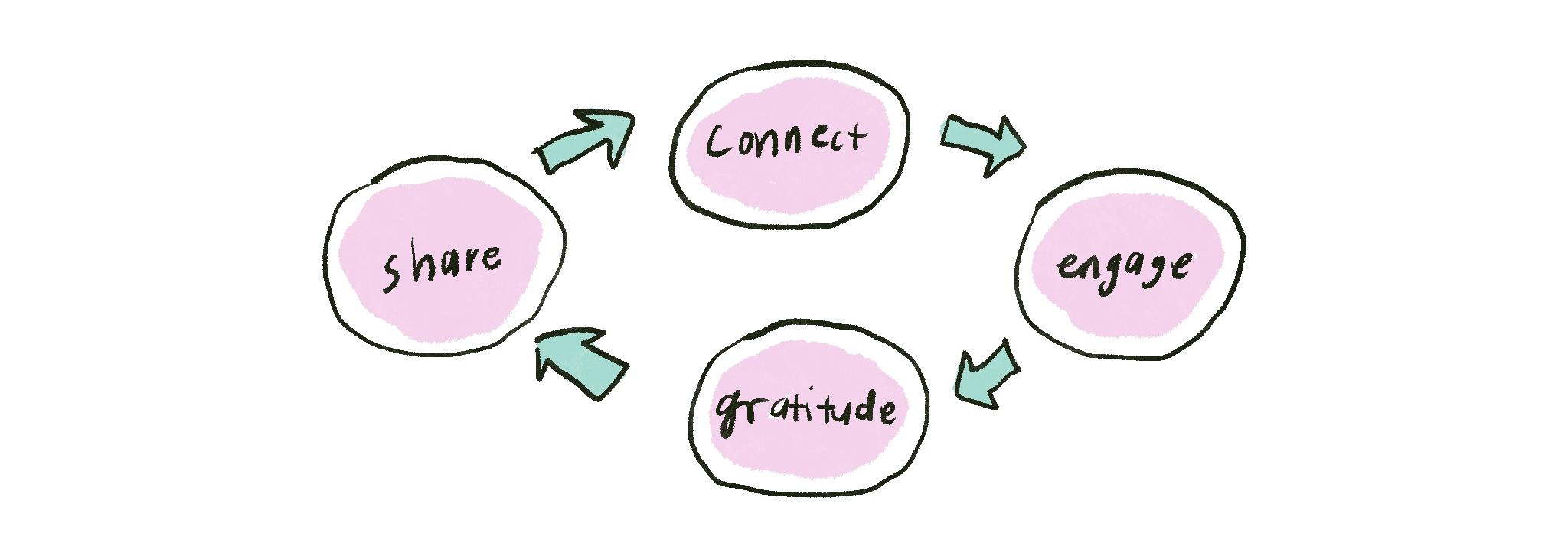
Cycle process of "Share - Connect - Engage - Gratitude"

After understanding different contexts of users’ motivation and desired outcomes, I identified the key goals of the users; share - connect - engage - gratitude into a cycle process to provide lasting value to the users. So for that reason I feel like its the best for me to do multi-persona journey mapping for both Mike and Elle to show how the interaction of their journeys, how it intersects and would meet in the touchpoints based on their own personal expectations, needs and thoughts.

Having multiple personas on a single map will let you look at where the journeys intersect. And then you might find out that something you considered a pain-point that existed in a vacuum, is actually the consequence of a bad interaction between two personas. - Multiple Personas on one customer journey map, Anastasia Schebrova of UXPressia

User journey map for Mike & Elle

Ideate03

Generating solutions

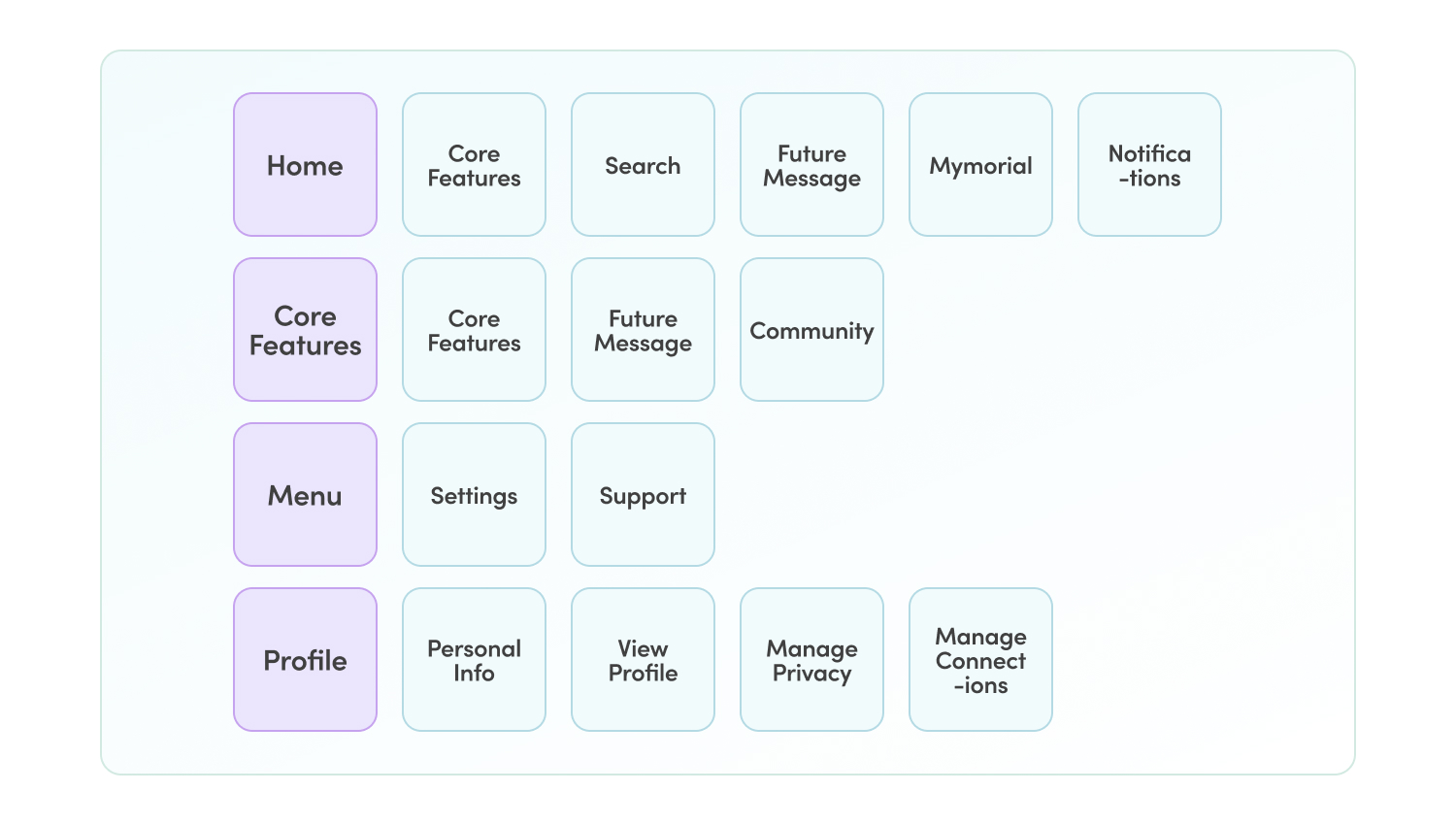
Card Sorting

Card sorting was done to categorise all the features under different sections which will further help in organising the information architecture.

Card sorting; Home, Core Features, Menu & Profile

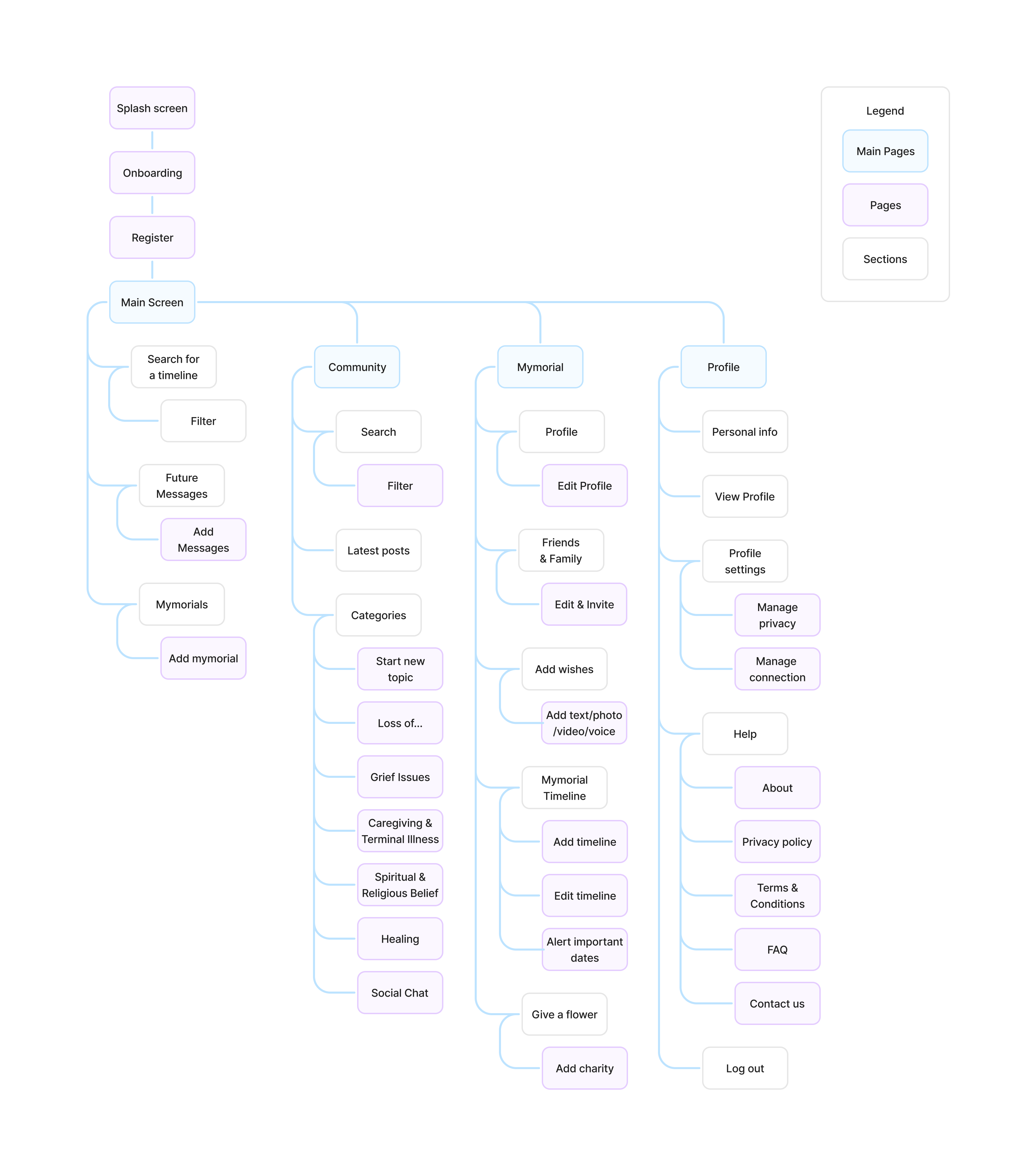
Information Architecture

The card sorting results were further refined to fit the goals of the application. Some of the features were re-categorised to make it easy and frictionless for users to find.

Information Architecture

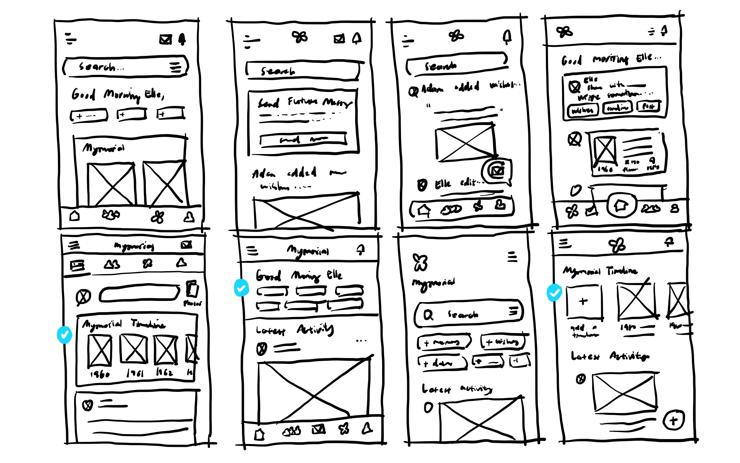
Crazy8 & Sketches

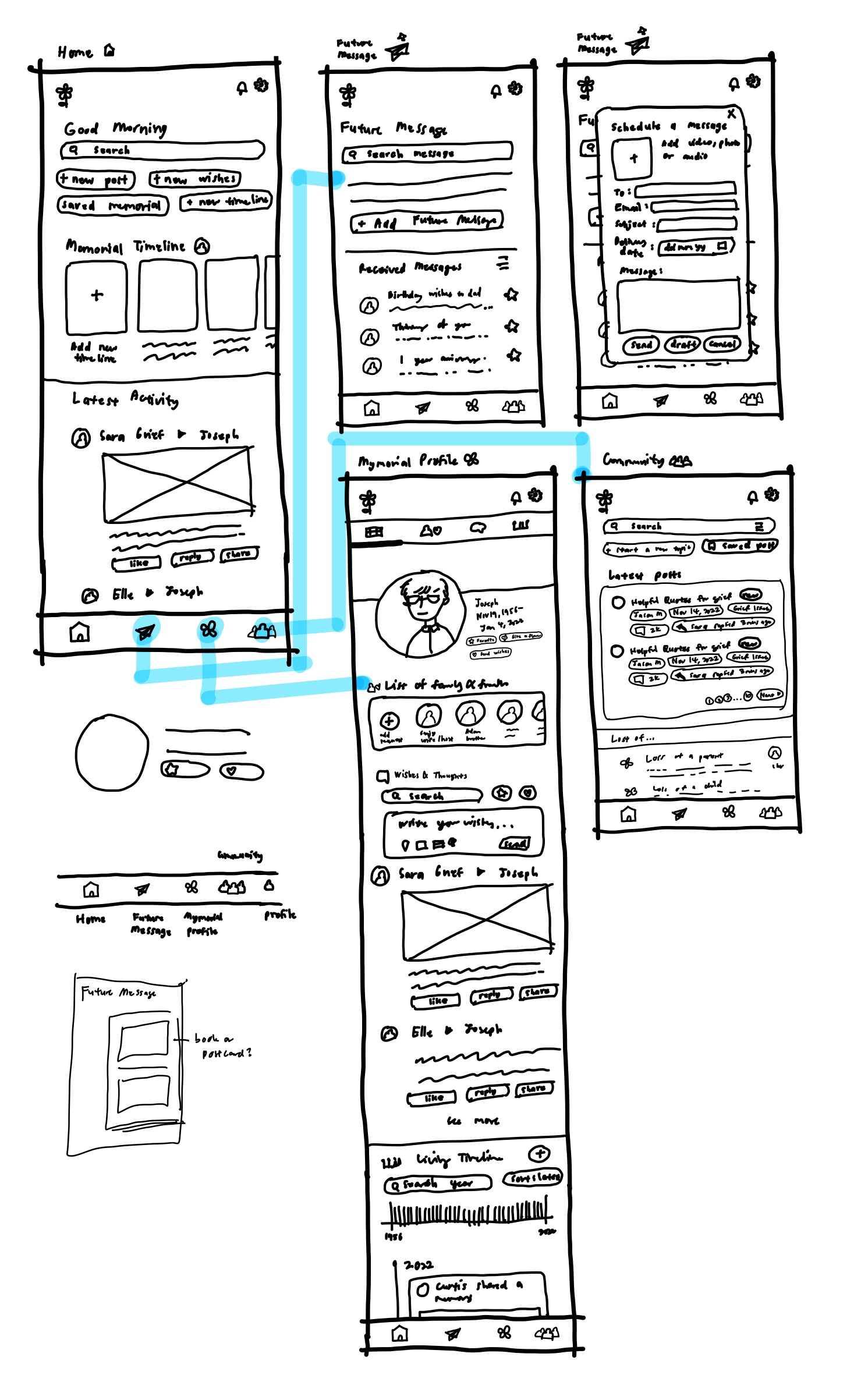
Taking what I’ve learned throughout my process to this point, I sketched out the screens I'll be designing based on persona, user goals, and requirements. I also referred to competitors' apps to see the design patterns as well. Doing this will help layout content quickly and try out multiple ideas without the barriers of technical tools.

Crazy8 sketches exploration were done for the home page layout based on Information Architecture and competitors app layouts, 3 designs were picked which then filtered to one as more design exploration is done.

Rough sketches of layout exploration for each main pages.

Wireframing & Initial Insights

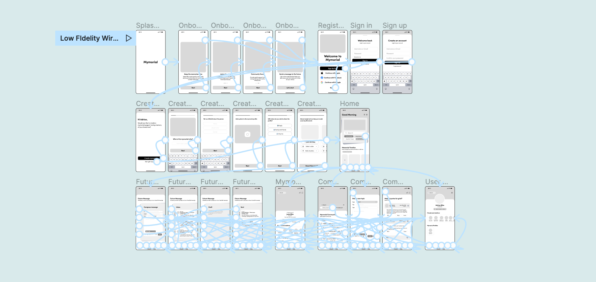
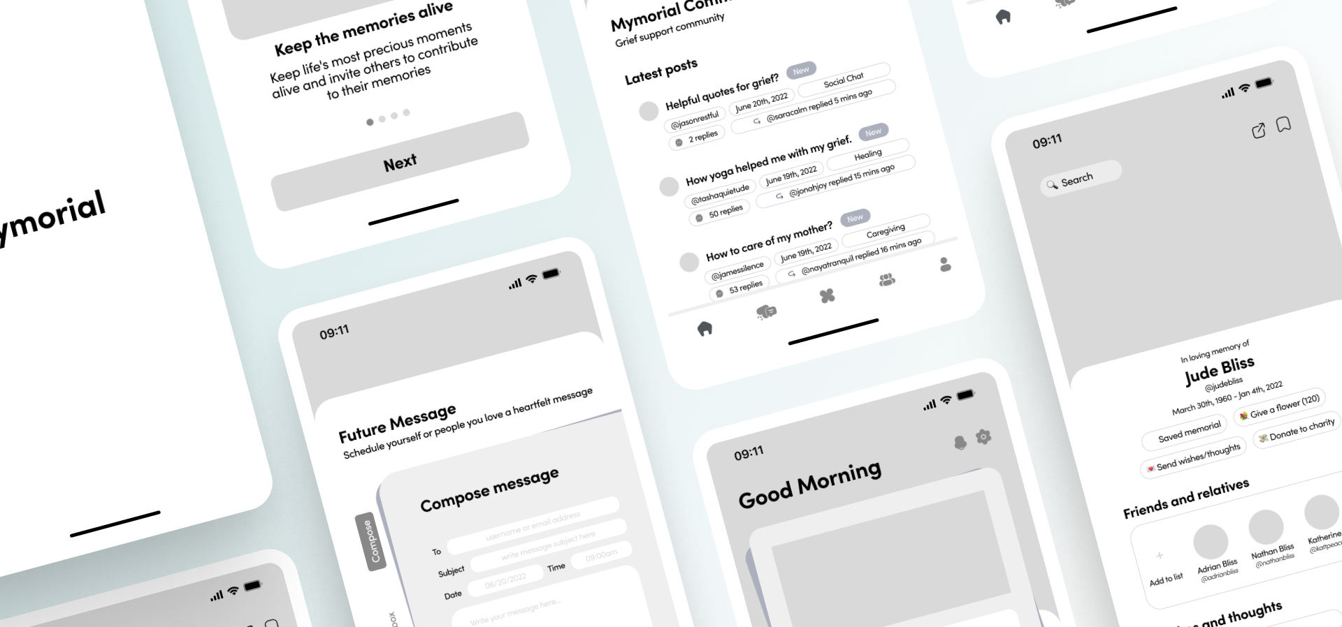
The sketches sessions gave me an idea of ​​the direction to go, so the next step is for me to start with the wireframing and eventually the prototype. The initial prototype can be viewed here.

Wireframing & initial wireframing prototype

Prototype04

Building representation of ideas and refining

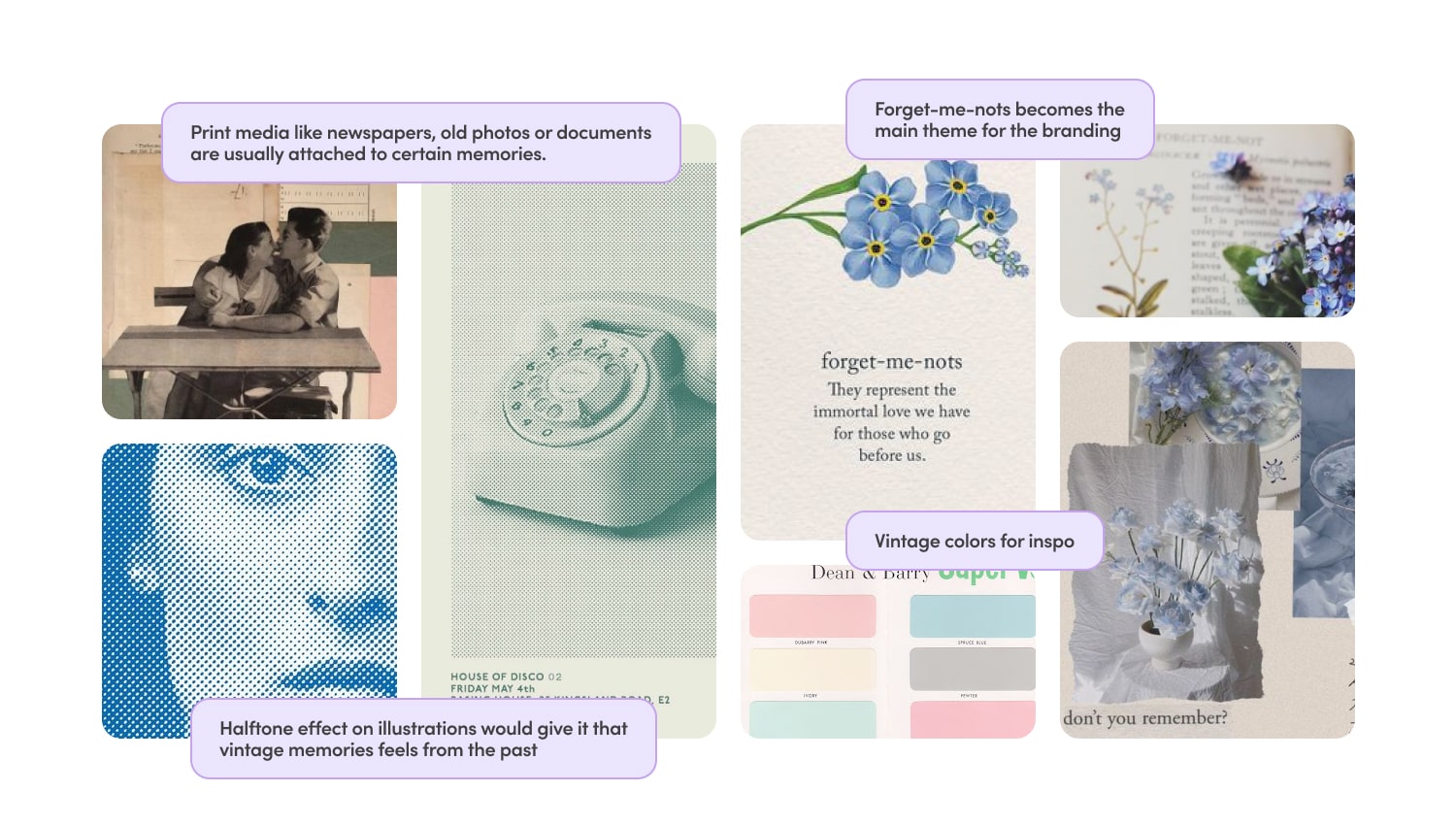
Branding

Before moving on to the UI design, I began with planning the concept by discovering and determining brand's attribute & brand identity. For the naming process, I came up with several important keywords that users can easily identified & correlated to. The name "Mymorial" came to mind as it is a portmanteau between memory and memorial, two main keywords that summarised the general idea for this app. Excitingly the name is unique and hasn't been used yet.

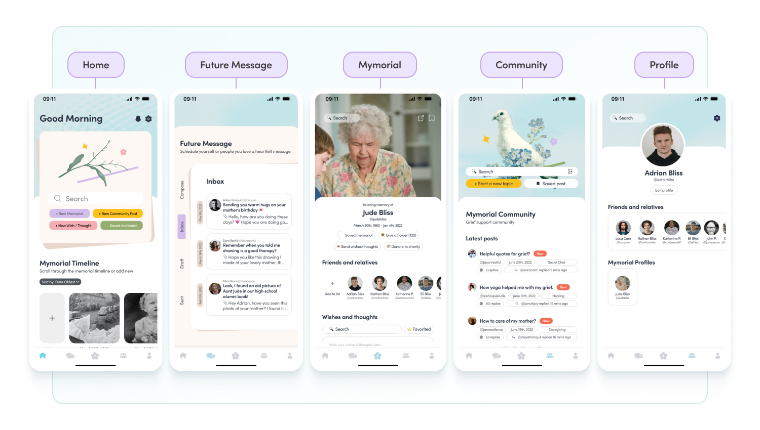
High Fidelity Design

With the visual style defined for the UI design and wireframes ready, it's time to put things together. I connected my hi-fi designs into a clickable prototype with some custom and in-built animations in Figma. That will allow me to test the app on the first group of users. The initial prototype can be live-previewed here.

Test05

Collecting information about usability

Usability Testing

After the initial prototype is made, I tested it on 5 users. I made a usability test plan  where I outlined the test objectives, methods, KPIs and defining the core tasks for users to complete. The usability plan also included a script for the remote unmoderated sessions.

There are 4 main tasks for participants to do; creating an account, setting up a Mymorial profile, send a future message & create a topic on Mymorial community forum. Throughout the tasks, I asked the users to talk through their thought process and speak out when something is unclear or makes them frustrated.

After the usability study, I asked participants to fill up a short 10 items of System Usability Scale questionnaire.
‍
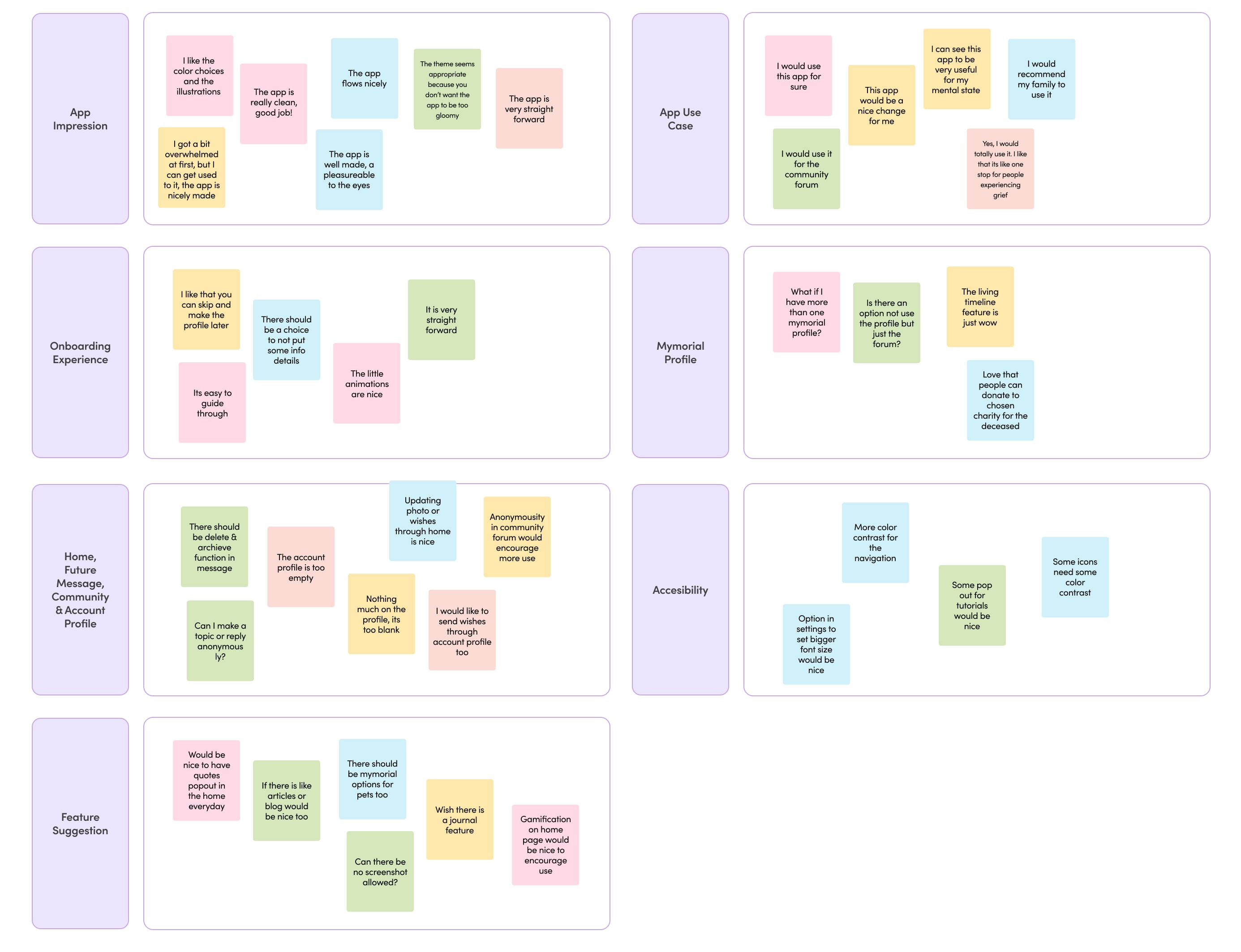
Lastly, after collecting insights from the participants, I made an affinity diagram to organise a large number of ideas into their natural relationships. This is so that I can see a specific pattern that I can improve for better user experience.

Affinity Map

After the usability study, I transferred & gathered the information from the interview session into the (digital) post-it note on Figma. In which then I turned it into an affinity map to synthesise the finding from the interviews. By doing this, I was able to document the research findings and uncover the issues in my designs so I could further prioritise the issues for revision and improvement.

Affinity map from usability testing interviews

Here are the most important changes that needed to be made based on the feedback provided by the participants during usability testing:


‍

Final prototype

With all the issues and pain points been revised and with established UI design elements, I created the final prototype that provides all the information necessary for users to use this product seamlessly without any friction.

View Final Prototype

Afterword

What have I learned

1 Since this is my first ever case study designing end-to-end mobile app, I have learned so much valuable lessons and gained some experiences throughout the process of making this project. It was a steep learning curve for me and I made a lot of mistakes along the way.
2 I have learned the crucial role of UX writing and microcopy which is definitely not my strongest forte. Being able to guide users clearly would helps them to reach their goals immensely without any friction while interacting with the app.
3 I gained a lot of empathy to bereaved people throughout my study, especially because it is a topic very personal to me and my family and many others that experienced losing someone in midst of COVID-19.
4 I have learned to prioritised strategy to ensure the case study to be systematically on track. After having tons of ideas from the brainstorming session, I had to step back and be realistic about what was feasible within the time constraints and decide which ones to prioritise for implementation.

What I would have done differently?

1 I would have prioritised accessibility in my design by using adequate colour contrast, adopt an inclusive user testing, and to include accessibility in every research stage as possible (user personas, user stories, etc). Other than time constraint, I was late to come to the realisation that I should be more aware of this matter mid case study and would love to learn and adapt more inclusive user experience in my future project/work.
2 I would have teamed up with another designer so we could brainstorm, bounce off ideas and have second opinion on matters. It's challenging to come up with a new app concept on your own, and it would have been beneficial to have someone to collaborate with.

‍

Thank you for your time :)

Let's discover

Next work

limiedesign@gmail.com

© 2022 Made by Limmy with  💖 in Kuala Lumpur, Malaysia.

Last updated August 2022.